It's been a while since I posted. Sue me.
This evening
Merujo and I went to see "MirrorMask." Big mistake. Not the hanging out with Merujo, but rather the movie.
I don't know how it ended, as we ended up walking out of it. If you want to hear the instantaneous review of the film, you can hear my audioblog entry at Merujo's blog
here.
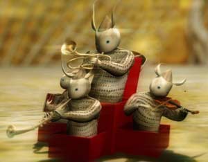
The film was beautiful, and displayed excellent production values, especially given the shoestring budget the filmmakers had. However, it would have been nice if there had been more than a shoestring's worth of plot to keep me engaged in it. There were some really interesting bits, especially when the Good Prime Minister gave his overview of the current political situation (I loved the
little band in the red box), but moments like that were few and far between. The protagonist's drawings were fairly compelling, too. The funniest part of the entire film actually took place in the second row of the theater. A homeless guy had come in halfway through and began snoring. Very loudly. Philistines that we are, Merujo and I both found it hilarious, but our sense of humor was not shared by the other patrons (of whom there were maybe seven or eight).
I wanted to be able to recommend this film. Really. But I suppose I can't do that if I walked out of it early, can I?

The Queen of Darkness—My, what large pupils you have

